Say, what? Step-by-step!

So I recently posted a step-by-step, mini-tutorial I suppose, on my Instagram (@courtneytrowbridgeart) walking through how I completed my latest illustration in a series I’ve dubbed my LA alter egos. BUT, I had no idea that IG’s character limit was 2,200 and ya’ll know I like to talk. I had to massively edit down what I wrote to get it on there, so I figured it was a good time for a new blog post.

Cover image

Let’s get started! Maybe one day I’ll actually have some time lapses, but I need to focus on work and finding work right now (also, I might be alone here, but I really love to learn from reading vs. video…video is great too, but it makes me get sleepy after about an hour). Anyway, this is a tried-and-true method that’s great for comics because you can really assembly line it and work in stages and it’s really fun.

0 Block in

1. Block in – Using reference, I block in the figure. I’ve erased parts of it while I was working (In attempts to use my sketch layers with my line art…it didn’t work) so it’s a little patchy now. But it’s this sloppy. (She looks like Busy Philipps to me here!)

1 Sketch

2. Sketch – Then I do a second pass over the first to get some actual detail in. Everything is pretty worked out now.

2 Lines

3. Lines – Then it’s all about lines for a bit. The Rotate tool is my friend and I sometimes will use the Pen tool on particularly smooth long lines, making sure it doesn’t look weird and noticeable next to the ones I did by hand and that the stroke weight matches. You kind of have to muck those up a bit, though, and I would use it sparingly if you’re not just going to do the whole thing in vector. Also, get in there with the Liquify tool if you draw a line that’s almost perfect except for one little part – insta-fix!

3 Flats

4. Flat color – Next, I add flat color under my lines. I generally just use a hard brush so it still feels like painting. I like to do the entire figure to separate it from the background like a mask on one layer, and then I do each different color/area on a separate layer on top clipped down to it (ie clipping mask), so I don’t have to worry about the exterior outline anymore. I pretty much always have to come back and adjust these layers as I continue on and see I’ve bled a bit past the edges, etc.

4 Recolor lines

5. Recolor lines – Then I recolor the lines to match the flat colors and soften the overall look using a new layer clipped to my line work with either a Normal or Color layer (here it’s just Normal). This is an easy step, but I left it all on it’s lonesome because I think the change it has on the image is really a big one!

5 Face contour

6. Face contour – This step seemed necessary for a close-up like this one to really carve in our features in a graphic way. Thinking about lighting a little, but not doing anything dramatic. Also added a hair shine with a hard brush and erased into it first with a hard brush to shape it, and then with a soft brush to push it back (some of the erasing was done later with other layers on which is why it looks a little weird in parts until you see the other layers back on below).

6 Gradient Blush

7. Gradients and blushing – Here I pushed the tattoo color back a bit to fade into the skin, then I start adding some blush and makeup colors, and add gradients to the hair, sunglasses and body using a couple layers for each section. These are typically Multiply layers and sometimes I screw around with the opacity. I use all the flat color layers as masks to speed stuff up and I really like using CTRL + H to hide the marquee selection lines so I can see what I’m doing.

7 Gradient Shadow

8. Gradients and shadows – Then I just keep pushing the shadows a bit more, especially by adding that big one under her neck. I also like to use the Gradient tool to add one large swath of gradient down her entire figure, but for her I knocked it back a lot since I wanted her complexion to stay pale.

8 Highlights

9. Highlights, details and paint over – Now I add a bunch of highlights and do some paint over on messy parts. I stroked the sunglasses frame and lenses to make them pop a little more and I decided I needed some background interest, so I added these polka dots in from a black and white image and recolored them and then added a stroke around them to keep up the graphic feels. I think I actually added in elements of the background at some point earlier on….but you get the idea.

fashionsketchblue

10. Color balance – I always do some degree of re-balancing the colors in my image and I also do it as I work along, not all at the end. Experiments! So like, when I darkened the background I needed to lighten the hair (which also required that I paint over my now too dark line work on the hair). The change in background from the is just a circular royal blue gradient on a Multiply layer that’s stretched with the Transform tool. There’s a little vignette added to push the eyes in, and then…my favorite…I often will fill my canvas with a warm pink or orange on an Overlay or Soft Light layer and will just screw around with the hue and opacity (this one is a pink Overlay at 15%) until I get something I like. It usually adds that extra oomph and is basically the same thing as added one of those photo filters.

And suddenly jewelry has jumped onto the image (which are two things I own)! I added them afterward because it needed it and I kind of always meant to add it in but got lazy and then did it at the end. :D These were both done using the exact same methods as I used above for the rest of the image.

And I thought my heart logo looked cute on this one. Thanks for checking this out and hope you found it useful! <3 <3 <3

BlueFashionProgress

LA alter egos

bitchplz

So, I created a drawing that inspired the start of a series of illustrations I’m dubbing my LA alter egos. There really is something amazing about the creative fashion in this city; it’s not just about the colors and the bare skin, but also how fashion isn’t ageist here. Sure, everyone’s judging everyone in the end, whatever, but I don’t feel old and weird here if I want to have my stomach out or wear short shorts. It’s nice. But, seeing as I don’t have any tattoos, I thought it would be fun to get all my fashion fantasies out.

fashionsketchblue

Yes, I’ve always wanted that snake tattoo secretly, but I don’t really know about the permanence so for now I prefer to encourage my dude to get more tattoos.

Stay tuned for another blog post coming up, so I can post the looooooong version of my step-by-step on the second image, so expect progress shots and lots of helpful long-windedness. <3

conceptualizing an animation style character – Maid Marian

During a previous post I showed some of these pieces and talked briefly about trying a hand at animation styles. You can also find them in my character design portfolio. I thought I’d expand a little upon it, as I have new work for the project to show. Apologies if any of this is repetitious.

My inspiration came from the 1982 animated film, The Last Unicorn, during which there is a scene where one of our main characters, the wizard Schmendrick, conjures up a vision of Robin Hood and his Merry Men for a bunch of outlaws who try hard (and fail) to pattern themselves after the legendary hero. The outcome is NOT great (Schmendrick ends up tied to a tree in one of my favorite scenes in the film) but it’s the first time he’s able to actually produce magic. YAY.

I loved the idea of an animated Robin Hood story done in a style somewhat like The Last Unicorn’s and thought I’d at least start with developing our favorite lady, Maid Marian. Here’s where I started off. maidMarianSkinHairColors

I love her in all of the skin tones and hair colors but she’s usually a straight-up brunette or auburn-haired, so I decided I’d move forward with that. I have a degree in fashion design before I went to Gnomon to study entertainment art and modeling, and one of my favorite things to do when I still worked in fashion was drawing “flats”, or flat technical drawings of garments that show off the pattern shapes and all of the details effectively. Flats are symmetrical, but essentially I applied the same idea. And yes, I freakin’ love paper dolls.

maidMarianCostumeFlats

Once you get started, it’s easier to keep going with these because you can just build new pieces off of the ones you already have – much like when in fashion we were creating flats in Illustrator. You can create libraries of collars, sleeves, necklines, skirts, and just stitch and Frankenstein them together to save yourself time. But in my case here, because I created these on independent layers, not only can I easily change the colors (the line art, base color and shading colors are all separate) now I can also have fun playing dress up!

maidMarianCostumes3

I would love to figure out the programming behind making a dress-up app, but let’s just hope one day I’ll be in the position of paying someone who already knows how to do it to do the back end so I can just focus on the content. I enjoyed this so much, it felt like a great piece for my portfolio when applying to animation studios so I decided I needed to do a series of expressions. On my Facebook page I asked friends to give me an emotion or mood, and then I drew it. Much the same as the clothing, once you get started you can keep building off the facial features you’ve built up – for example, once I had her with wide eyes, it worked for a lot of expressions.

maidMarianFaces

My favorite is still the eye roll. And I finally got around to drawing that goblet I imagined the costumed lady version of Marian would be holding. During this project, I realized I wanted to model her, too. I think seeing it fully realized in 3D would be so fun, and though I am not the best at texturing, I could polypaint her in ZBrush. The idea of 3D printing the finished model is also extremely exciting, and since I have been practicing setting up good topology in Maya and then detailing in ZBrush on simpler models (I recently and FINLLY got my feet wet and 3D printed a little wooden log haha) I kept thinking a lot about which program I wanted to start her in. In the end, ZBrush won out since I have more experience in character work in it and basically none in Maya. I did, however, spend a lot of time when taking her out of Dynamesh on getting ZRemesher to give me some quite decent topology. Hopefully it stands up when I get to printing her.

I also took it to Facebook to see which costume everyone liked best and there were a lot of differing opinions, but I liked how she feels identifiable in her Robin Hood outlaw outfit. So I needed a turnaround.

maidMarianTurnaround

And because I would be sculpting the clothing as subtools, I needed a quick sideview of her naked. I decided not to spend anymore time on creating a symmetrical front view because I felt confident I could figure it out from the asymmetric, slight 3/4 one I had. The side view doesn’t have the most elegant shading, but it’s really just quick and dirty production art that served a very, very helpful purpose.

maidMarianNakedFront-Side

That essentially is the whole development process behind the character. The sculpt isn’t finished yet, and frankly, I’ve just begun (about 5-6 hours in), but all this early work has helped immensely. Now it’s just putting in the hours. I may also use her as another guinea pig for Marvelous Designer, and get a good base for her clothes that I can detail in ZBrush. Here’s her progress so far.

MaidMarianScreenshot5-18


I will certainly update as she gets further along, but for now hope you enjoyed this post! Thanks for reading!

character design

I’ve been working on a bunch of new character designs lately, all in various stages of completion. I had a lovely experience recently doing a few illustrations for a toy client, DEFINITELY a dream client, and I had a great time, got to work on some great properties and learned a lot from a terrific art director. Nothing quite inspires one like getting a good opportunity, so I’ve been trying to keep up lots of personal work.

First off, I found this again today:

face studies14SM

Three faces, three ways – pseudo-realistic, comic, Disneyish…I’d like to think I’ve come a long way even since this, but it was a fun exercise and I still like ’em. Plus REDHEADS.

Recently, I’ve been adding work to the galleries, more often than I’ve been updating this. I have to say, I also have been enjoying ArtStation way more than my own website….eep, it’s true! Anyway, I’ve been having a ton of fun practicing a toonier approach to character design (though rest assured, I also have a painting or two in the works).

When I designed this Maid Marian character, I was thinking about what it would be like if there actually WAS a Robin Hood done in the style of The Last Unicorn. As you may remember, there’s a part in the beautifully animated tale (and of course, the phenomenal book) when Schmendrick creates more of his zany, one-day-I-will-be-a-genius-sorceror-I-swear magic (which is true) and summons a vision of Robin Hood, Marian, and the Merry Men, to Captain Cully’s dismay (resulting in the amazing boob tree scene, I KNOW). I mean, his outlaws were doing so well what with that 4-day rat soup and the mention of tacos. I loved the look of those Rankin/Bass films with all their amaze-balls Japanese animators doing a slightly more western style, so here is MY Lady Marian.

maidMarianCostumes3

maidMarianSkinHairColors

maidMarianCostumeFlats

I have a Bachelors in Fashion Design, which maybe I don’t talk about enough. Drawing flats was one of my favorite things when an assistant designer, so when I was creating Marian’s looks it was important to me that each piece still be a complete object. Also, I have several of these ALMOST paper doll projects, so I really need to turn one into an actual working doll with the tabs and slits.

So I’ll leave you with one more design here, but again will remind you that there’s more updates in the galleries. I can’t always be trusted to post about them all, though I will try!

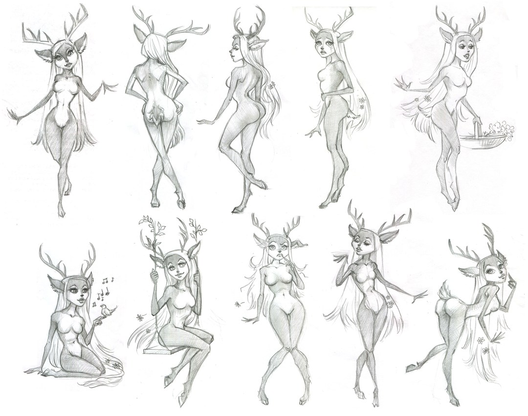
This little lady is from an animation class. Honestly, I hadn’t quite considered when I wanted to draw a deer girl, that I was, in fact, designing a furry. So, apparently that happened, but you know, we could just forget the whole furry phenomenon and remember that the Greeks invented things like satyrs, and that was perfectly respectable material for artists prior to the internet and poorly drawn anime, okay?

deerMaid

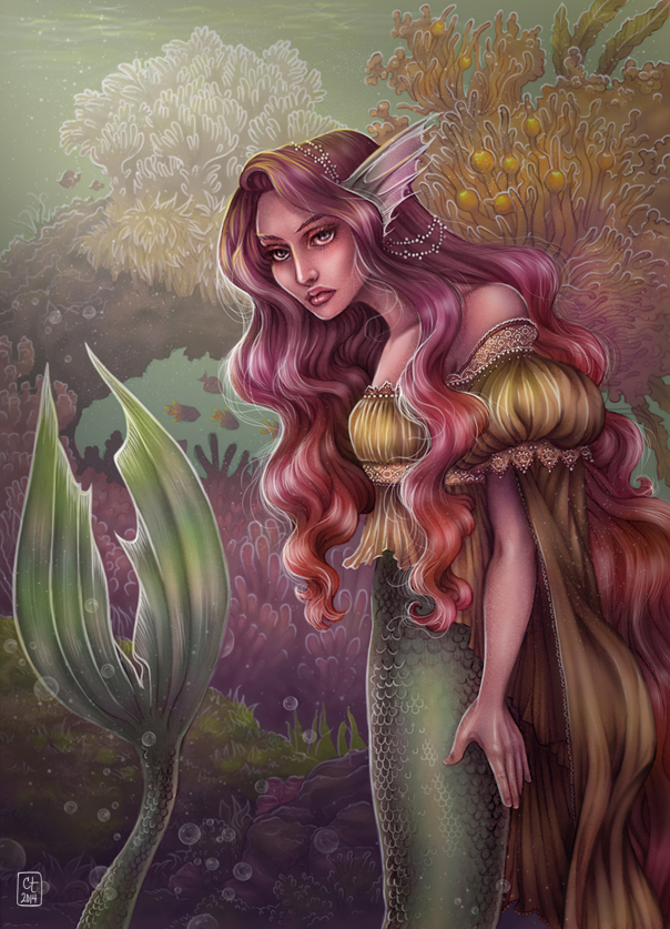
mermaid time again

mermaidsig

mermaidsketch

They never get old.

Sketch from my sketchbook was cleaned up and recolored in Photoshop, then colored away!  Honestly, the anatomy positioning of the mermaid is total crap (sooooo wooden), but it was fun to color and I still like how it came out.

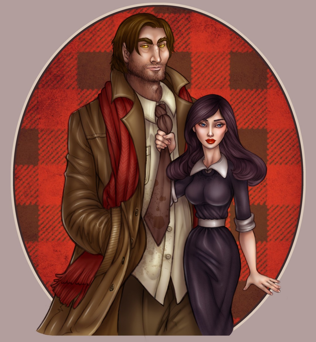
Bigby and Snow

Snow White and Bigby Wolf

After taking a while to come around, I’ve been marathoning Fables. Um, NO surprise I’m all into Bigby, nope.

© Fables, Vertigo, Bill Willingham, etc.

Rapunzel sneak peek

I’ve been working on my own children’s book for about a year and a half, in between other book projects I’ve been doing for clients.  Rapunzel was one of my favorite fairy tales as a kid, augmented by the Peck Gandre Rapunzel paper doll I had then!  My reason for wanting to retell the tale, aside from my love of it, was that the original (as with most fairy tales) really smoothes over a bunch of complications!  My idea was to create something a little bit more epic…and I’m really hoping to finish it this year (since I’ve learned after beginning the project that Disney is coming out with Rapunzel Unbraided next year).

Here is a sneak peek!  For secrecy, I’m not going to explain the drawing.  It’s only concept anyway.


This is a ballpoint pen sketch that's then messed around with in Photoshop.

This is a ballpoint pen sketch that's then messed around with in Photoshop.