YouTube channel updates

I’ve been updating my YouTube lately, and started with a new piece of my Renaissance Sailor Moon portraits. Just to get my feet wet, it’s a simple series of timelapse videos of me drawing her in Clip Studio Paint extremely sped up with no audio. I really needed to get back into the swing of editing videos again!

But now that I have a handle back on it all again, I’m going to continue creating videos on my approach to creating digital art with commentary and music when I speed things up! I dunno about you, but I tend to scrub through when I’m watching a timelapse, so hopefully these little test videos aren’t too dull! xoxo

Find my YouTube HERE!

Print shop open!

It only took 12,000 years but I finally opened a print shop! I liked Inprnt’s pared down array of goods – just prints, canvas prints, acrylic prints, cards and phone cases. It bugs me a little when you don’t have the best control over the placement of your artwork when it’s offered on a lot of different products.

Click HERE to take a look! To celebrate I’m running a 20% discount with the coupon code: VQDFEGR5

I have four prints available right now and hope to add more as I go along. Updates on new shop items will be on my Instagram @courtneytrowbridgeart!

Say, what? Step-by-step!

So I recently posted a step-by-step, mini-tutorial I suppose, on my Instagram (@courtneytrowbridgeart) walking through how I completed my latest illustration in a series I’ve dubbed my LA alter egos. BUT, I had no idea that IG’s character limit was 2,200 and ya’ll know I like to talk. I had to massively edit down what I wrote to get it on there, so I figured it was a good time for a new blog post.

Cover image

Let’s get started! Maybe one day I’ll actually have some time lapses, but I need to focus on work and finding work right now (also, I might be alone here, but I really love to learn from reading vs. video…video is great too, but it makes me get sleepy after about an hour). Anyway, this is a tried-and-true method that’s great for comics because you can really assembly line it and work in stages and it’s really fun.

0 Block in

1. Block in – Using reference, I block in the figure. I’ve erased parts of it while I was working (In attempts to use my sketch layers with my line art…it didn’t work) so it’s a little patchy now. But it’s this sloppy. (She looks like Busy Philipps to me here!)

1 Sketch

2. Sketch – Then I do a second pass over the first to get some actual detail in. Everything is pretty worked out now.

2 Lines

3. Lines – Then it’s all about lines for a bit. The Rotate tool is my friend and I sometimes will use the Pen tool on particularly smooth long lines, making sure it doesn’t look weird and noticeable next to the ones I did by hand and that the stroke weight matches. You kind of have to muck those up a bit, though, and I would use it sparingly if you’re not just going to do the whole thing in vector. Also, get in there with the Liquify tool if you draw a line that’s almost perfect except for one little part – insta-fix!

3 Flats

4. Flat color – Next, I add flat color under my lines. I generally just use a hard brush so it still feels like painting. I like to do the entire figure to separate it from the background like a mask on one layer, and then I do each different color/area on a separate layer on top clipped down to it (ie clipping mask), so I don’t have to worry about the exterior outline anymore. I pretty much always have to come back and adjust these layers as I continue on and see I’ve bled a bit past the edges, etc.

4 Recolor lines

5. Recolor lines – Then I recolor the lines to match the flat colors and soften the overall look using a new layer clipped to my line work with either a Normal or Color layer (here it’s just Normal). This is an easy step, but I left it all on it’s lonesome because I think the change it has on the image is really a big one!

5 Face contour

6. Face contour – This step seemed necessary for a close-up like this one to really carve in our features in a graphic way. Thinking about lighting a little, but not doing anything dramatic. Also added a hair shine with a hard brush and erased into it first with a hard brush to shape it, and then with a soft brush to push it back (some of the erasing was done later with other layers on which is why it looks a little weird in parts until you see the other layers back on below).

6 Gradient Blush

7. Gradients and blushing – Here I pushed the tattoo color back a bit to fade into the skin, then I start adding some blush and makeup colors, and add gradients to the hair, sunglasses and body using a couple layers for each section. These are typically Multiply layers and sometimes I screw around with the opacity. I use all the flat color layers as masks to speed stuff up and I really like using CTRL + H to hide the marquee selection lines so I can see what I’m doing.

7 Gradient Shadow

8. Gradients and shadows – Then I just keep pushing the shadows a bit more, especially by adding that big one under her neck. I also like to use the Gradient tool to add one large swath of gradient down her entire figure, but for her I knocked it back a lot since I wanted her complexion to stay pale.

8 Highlights

9. Highlights, details and paint over – Now I add a bunch of highlights and do some paint over on messy parts. I stroked the sunglasses frame and lenses to make them pop a little more and I decided I needed some background interest, so I added these polka dots in from a black and white image and recolored them and then added a stroke around them to keep up the graphic feels. I think I actually added in elements of the background at some point earlier on….but you get the idea.

fashionsketchblue

10. Color balance – I always do some degree of re-balancing the colors in my image and I also do it as I work along, not all at the end. Experiments! So like, when I darkened the background I needed to lighten the hair (which also required that I paint over my now too dark line work on the hair). The change in background from the is just a circular royal blue gradient on a Multiply layer that’s stretched with the Transform tool. There’s a little vignette added to push the eyes in, and then…my favorite…I often will fill my canvas with a warm pink or orange on an Overlay or Soft Light layer and will just screw around with the hue and opacity (this one is a pink Overlay at 15%) until I get something I like. It usually adds that extra oomph and is basically the same thing as added one of those photo filters.

And suddenly jewelry has jumped onto the image (which are two things I own)! I added them afterward because it needed it and I kind of always meant to add it in but got lazy and then did it at the end. :D These were both done using the exact same methods as I used above for the rest of the image.

And I thought my heart logo looked cute on this one. Thanks for checking this out and hope you found it useful! <3 <3 <3

BlueFashionProgress

LA alter egos

bitchplz

So, I created a drawing that inspired the start of a series of illustrations I’m dubbing my LA alter egos. There really is something amazing about the creative fashion in this city; it’s not just about the colors and the bare skin, but also how fashion isn’t ageist here. Sure, everyone’s judging everyone in the end, whatever, but I don’t feel old and weird here if I want to have my stomach out or wear short shorts. It’s nice. But, seeing as I don’t have any tattoos, I thought it would be fun to get all my fashion fantasies out.

fashionsketchblue

Yes, I’ve always wanted that snake tattoo secretly, but I don’t really know about the permanence so for now I prefer to encourage my dude to get more tattoos.

Stay tuned for another blog post coming up, so I can post the looooooong version of my step-by-step on the second image, so expect progress shots and lots of helpful long-windedness. <3

Apologies!

Sorry for all the bunk posts, guys! I set up an IFTTT from my Instagram account to update this blog because I’ve started posting lots of sketches on IG, and thought my test looked fine, but then saw that, nope, it wasn’t posting the pics. Yikes, apologies for the pseudo-spam, and I’ve shut off the feed until I can find something that works.

In the meantime, enjoy one of the recent sketches I thought had posted over here….

girlsketch

Rickon ‘n Shaggydog

RickonShaggydog
Today’s prompt: “snow nomad and his shaggy dog”.
CLEARLY they meant I should do behbeh Rickon Stark and Shaggydog living the tough life on Skaagos. Since I missed yesterday because headache, I made it a bit nicer.

conceptualizing an animation style character – Maid Marian

During a previous post I showed some of these pieces and talked briefly about trying a hand at animation styles. You can also find them in my character design portfolio. I thought I’d expand a little upon it, as I have new work for the project to show. Apologies if any of this is repetitious.

My inspiration came from the 1982 animated film, The Last Unicorn, during which there is a scene where one of our main characters, the wizard Schmendrick, conjures up a vision of Robin Hood and his Merry Men for a bunch of outlaws who try hard (and fail) to pattern themselves after the legendary hero. The outcome is NOT great (Schmendrick ends up tied to a tree in one of my favorite scenes in the film) but it’s the first time he’s able to actually produce magic. YAY.

I loved the idea of an animated Robin Hood story done in a style somewhat like The Last Unicorn’s and thought I’d at least start with developing our favorite lady, Maid Marian. Here’s where I started off. maidMarianSkinHairColors

I love her in all of the skin tones and hair colors but she’s usually a straight-up brunette or auburn-haired, so I decided I’d move forward with that. I have a degree in fashion design before I went to Gnomon to study entertainment art and modeling, and one of my favorite things to do when I still worked in fashion was drawing “flats”, or flat technical drawings of garments that show off the pattern shapes and all of the details effectively. Flats are symmetrical, but essentially I applied the same idea. And yes, I freakin’ love paper dolls.

maidMarianCostumeFlats

Once you get started, it’s easier to keep going with these because you can just build new pieces off of the ones you already have – much like when in fashion we were creating flats in Illustrator. You can create libraries of collars, sleeves, necklines, skirts, and just stitch and Frankenstein them together to save yourself time. But in my case here, because I created these on independent layers, not only can I easily change the colors (the line art, base color and shading colors are all separate) now I can also have fun playing dress up!

maidMarianCostumes3

I would love to figure out the programming behind making a dress-up app, but let’s just hope one day I’ll be in the position of paying someone who already knows how to do it to do the back end so I can just focus on the content. I enjoyed this so much, it felt like a great piece for my portfolio when applying to animation studios so I decided I needed to do a series of expressions. On my Facebook page I asked friends to give me an emotion or mood, and then I drew it. Much the same as the clothing, once you get started you can keep building off the facial features you’ve built up – for example, once I had her with wide eyes, it worked for a lot of expressions.

maidMarianFaces

My favorite is still the eye roll. And I finally got around to drawing that goblet I imagined the costumed lady version of Marian would be holding. During this project, I realized I wanted to model her, too. I think seeing it fully realized in 3D would be so fun, and though I am not the best at texturing, I could polypaint her in ZBrush. The idea of 3D printing the finished model is also extremely exciting, and since I have been practicing setting up good topology in Maya and then detailing in ZBrush on simpler models (I recently and FINLLY got my feet wet and 3D printed a little wooden log haha) I kept thinking a lot about which program I wanted to start her in. In the end, ZBrush won out since I have more experience in character work in it and basically none in Maya. I did, however, spend a lot of time when taking her out of Dynamesh on getting ZRemesher to give me some quite decent topology. Hopefully it stands up when I get to printing her.

I also took it to Facebook to see which costume everyone liked best and there were a lot of differing opinions, but I liked how she feels identifiable in her Robin Hood outlaw outfit. So I needed a turnaround.

maidMarianTurnaround

And because I would be sculpting the clothing as subtools, I needed a quick sideview of her naked. I decided not to spend anymore time on creating a symmetrical front view because I felt confident I could figure it out from the asymmetric, slight 3/4 one I had. The side view doesn’t have the most elegant shading, but it’s really just quick and dirty production art that served a very, very helpful purpose.

maidMarianNakedFront-Side

That essentially is the whole development process behind the character. The sculpt isn’t finished yet, and frankly, I’ve just begun (about 5-6 hours in), but all this early work has helped immensely. Now it’s just putting in the hours. I may also use her as another guinea pig for Marvelous Designer, and get a good base for her clothes that I can detail in ZBrush. Here’s her progress so far.

MaidMarianScreenshot5-18


I will certainly update as she gets further along, but for now hope you enjoyed this post! Thanks for reading!

patternmaking 101

Recently my friend Santhosh and I both attended a webinar on Marvelous Designer with John Gotch via CGSociety and listened to him discuss his workflow and answer questions. I have messed around some in MD, and knowing a bit about patterns might be a help, though from the sound of it, most CG artists who’ve been using it just reference patterns using Google searches.

Santhosh asked me if I had any recommendations for patternmaking books to get him going, and I kick myself for not having my slopers OR my patternmaking book from my undergrad days (I am sensing I never cleaned out my locker?). BUT I did remember having a series of 1/4 scale patterns, showing how you can pivot darts around into various areas of a basic bodice pattern.

This is probably more than you ever wanted to see, Santhosh. But let’s pattern!

So just in case, the primary point of this lesson involves darts, which if you don’t know are used when sewing woven fabrics (like your basic jeans, or a man’s collared shirt…something that doesn’t stretch) to accommodate areas like the bust or hips so the garment still hugs the body. Darts are not necessary for knits and some stretch fabrics….because they stretch! Basically, you sew the two lines of the dart together lining up its notches at the bottom. Let me show you.

Bodice002Explanation copy.jpg

This is half a bodice front pattern. In essence you’d just stick that nice straight line on the right of the pattern (your Center Front, or CF) on a fold of fabric so when you cut the front bodice out you have both sides symmetrically. I’m not going to get into fabric grains because this really it just to show some basic shapes for the purposes of using Marvelous Designer. So just keep that straight up and down for now.

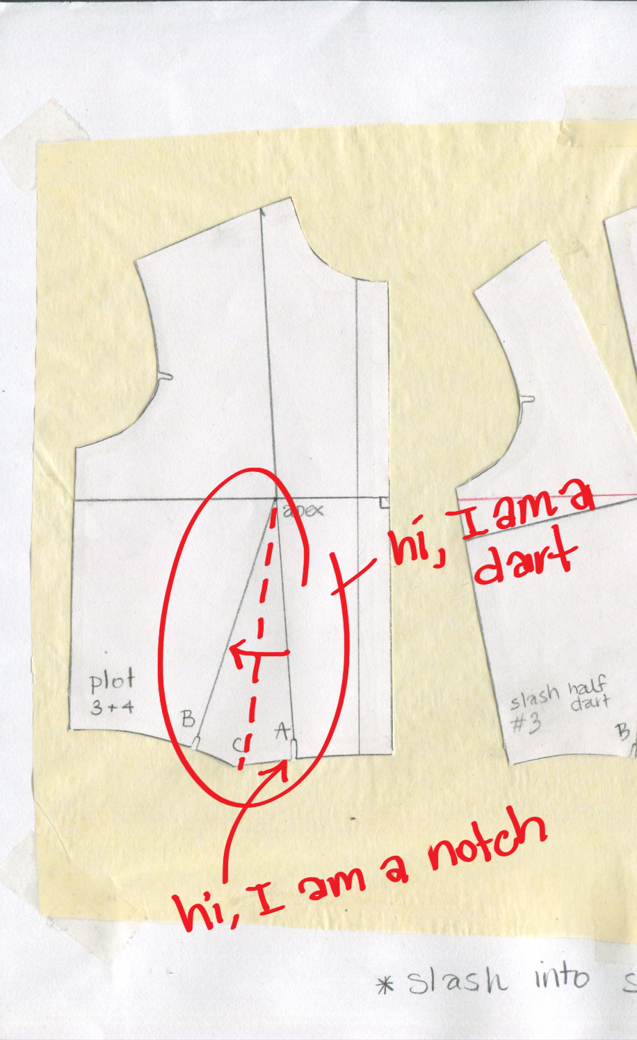
This is a very basic bodice pattern with a hem that would end up right on the natural waist. If you match the notch on the bottom to the other notch on the bottom, those two solid lines would be sewn together, and the dotted line I drew in red is where it would fold on the inside. The apex, where the dart ends, is the full point of the bust, ie. that’s where the nip goes. You know I couldn’t keep the convo so clean. Let me give you the image without the writing, and in this example you can see how I pivoted the pattern around from having a waist dart (marked plot 3+4), to have a shoulder dart instead (#4). You can also use #3  and have both darts if you wanted.

Bodice002

Another spot to pivot a dart into is the armhole. Make sure you follow anything my instructor corrected in red, because she knows best….and I am the queen of missing notches (which can also be marked by that delightful little ‘T’ shape). Note these patterns below have seam allowance unlike my plots above. This is so you have room to sew all your pieces together without making the pattern too small.

Bodice011.jpg

Here’s how we pivoted the waist dart into an armhole dart.

Bodice012

Here’s another classic courtesy of IsntThatSew.org…princess seams.

princess-seam-finished-pattern

This pattern is showing you a two-piece front bodice on the left, and a two-piece back bodice on the right. Note the difference in your basic neckline shape from front to back. Much higher in back, but even in the front this is going to sit right on the collarbone. If you want a scoop neck or a square neck or a v-neck, just draw that in, and of course in MD, you can quickly simulate what it’ll look like.

Hopefully that give you a decent idea of your very basic bodice front shape. You can now feel free in MD to lengthen it, or use a stretch fabric, in which case you don’t need a dart for fit. But you might want to use these ideas to create design lines, i.e., seams simply for aesthetic purposes. A classic for sic-fi bodysuits is using the princess seam, but instead of following the line all the way up into the shoulder as above, it curves into the armhole like this:

PrincessSeamfromArmhole

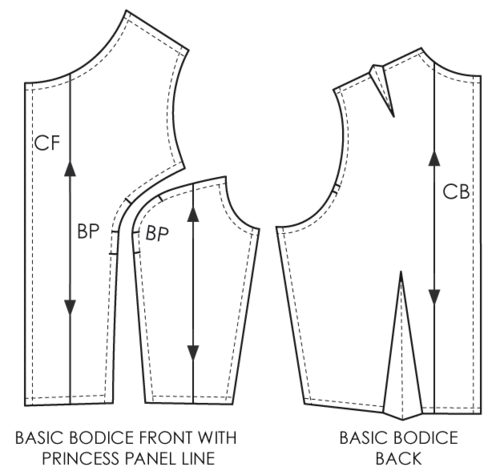
Image above courtesy of The Cutting Class. You can continue that line down the body if you lengthened the shape into a dress, with or without a waist seam. Making shapes in MD is much easier once MD5 added a cutting feature, something you’re really going to want when flat patterning.

So what if you’re drafting a pattern for a dude? Menswear patterns don’t really need the darts since men don’t have boobs. You can take these basic shapes (look back at the one marked Plot 3+4) and just draw it without the dart – and then you’ll want to straighten that hem perpendicular to your center front. Voila!

Moving on…let’s look at skirts a bit.

Skirt003

Skirt004

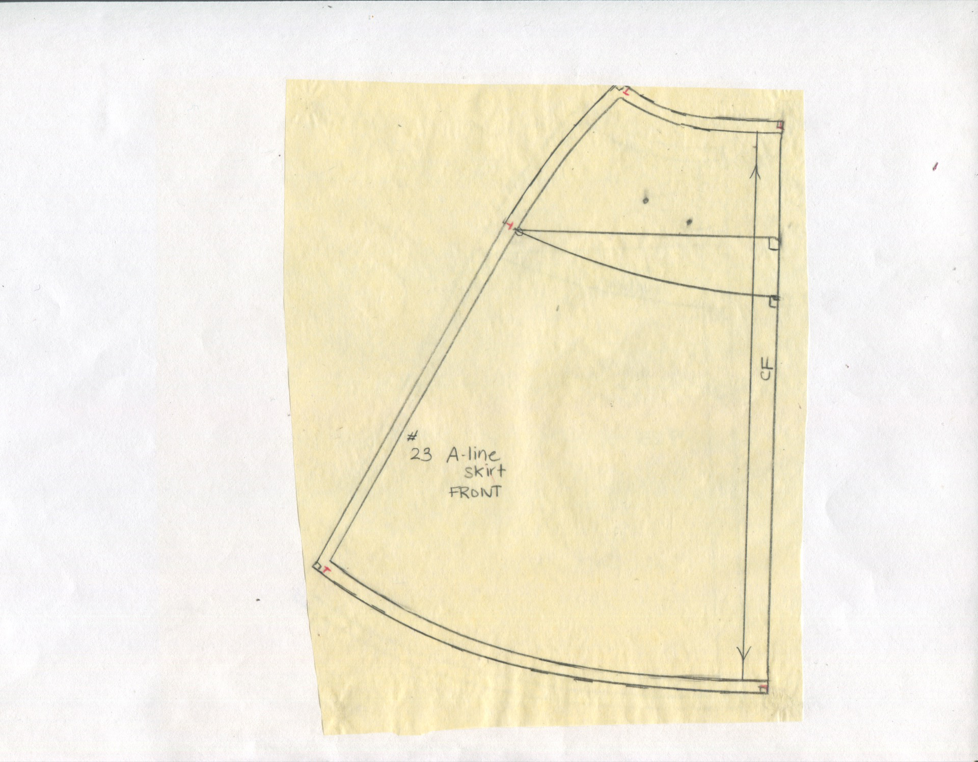
Note on the left of each picture we have a basic straight skirt shape with two waist darts. Again, this is half a skirt front and back, and would be cut on the fold, unless you wanted the seam down the center front and back. Here I’m slashing up those lines and closing the darts to create what is known as an A-line skirt (because it’s shaped like an A…real clever). Here’s what the A-line pattern would look like:

Skirt001

Skirt002


Skirts and bodices are typically what you learn to draft first in a patternmaking class, but to be honest (and this is coming from someone who kind of sucks at patternmaking) pants are NOT really hard. Let me look around for some good pant resources and I’ll create another post on that and sleeves next. Sleeves are not hard to pattern either, but they can be a bit of a pain to set into an armhole. Happily, MD will do all that work for us! Phew!