supper and cards

I’ve been screwing around with this image for a long enough time that having not posted any progress is shockingly bad behavior.  Consider this my pet project after the Blackwater scene, which may henceforth be periodically referred to as “the scene”, following several other pet projects which never really became pets.  They were more like strays.

Tudors.  I like them.  Can you guess who each person is?

I’m playing around with what exact year I’m deciding this scene took place.  It is possible the French king may disappear, which would take me back to my original intentions.  But I’m just not sure if this is 1522 that we can justify William Carey’s presence.  Maybe we can?  If this is 1520 he’s feeling kind of paranoid.  Here’s the same with some texture and fun curtains added.

Please pardon Percy’s thunder thighs and epic calves.  They will be fixed at a later date.

Throwing down some initial color strictly for fun, which is naughty of me since the sketch is incomplete.  It looks kind of neon to me now.

HINT: Characters are (in no specific order, ha) William Carey, Margaret Wyatt, Percy, Miss Anne Boleyn herself, a minstrel who is by no means Mark Smeaton, the ever delightful Jane Parker, Thomas Wyatt, Mary, George and then some various royal personages.  A possible Wolsey and Françoise de Foix are being obscured by all this texturing, but you can see them in the top sketch.

Venice, mother, proud and pretty…

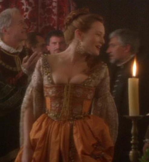
I don’t care if it’s a cheesy romance and probably entirely unlike Veronica Franco’s real life.  I enjoy the movie Dangerous Beauty.  For one, we get to see poor Murron from Braveheart alive and well as a fiery redhead.  And then mainly, I find the movie’s interpretation of Renaissance-period courtesan-wear to be extremely fun.

YES, cortigiana onesta (“intellectual courtesans” vs. their more street-walking counterparts, the cortigiana di lume) should be considered more as geisha and would not have worn arm-baring sleeves or shocked the nobility by wearing overskirts without underskirts…well, I’d assume in public, anyway.  The scene where Veronica is at court with everyone because the French king has come for a political meeting/really just wants to bag one of these famed courtesans is one of the times where the weirdness of this stands out, but far be it for me to judge creative exploration in what I find a fun, frivolous little film romp.
And because, orange dress!

Marco has just told her if she scrapes any lower she’ll have shoes for earrings. PUH-LEASE! Have fun listening to your wife recite the Psalms, Marco.

Props to this lovely blogger of Costume Captures, whose site is where I borrowed this image, and has done such a nice job capturing a lot of the main costumes from the film.  I have loved this dress since I was about 15.  So I’m making one!  There is literally no reason for me to be doing this, so I will probably languish over the project to my little heart’s content and will post progress as I go.

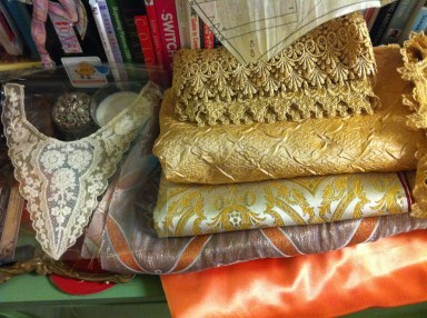
To inaugurate the project, allow me to show you my fabric and trim collection for this.  There is enough stuff here to design about eight dresses, so consider this like a mood board.  It will not all be used on this project, but it all inspires me!


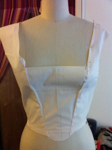
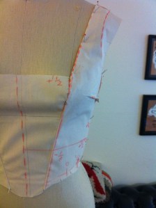
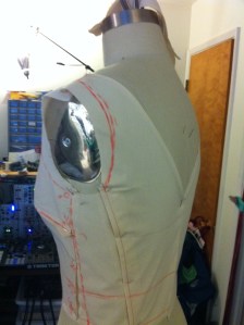
My typical first muslin usually goes down something along the lines of, how the h*** did I screw this up so badly?  But, that’s okay.  I just usually have to do few, so here’s some before and afters of my bodice muslin.  It’s so baggy in the bust (go crappy Simplicity pattern I started out with and tweaked), but then you can see where it’s pinned back into shape and later marked up for tracing.


musing on fanart….

So, I haven’t been using this blog quite as often as before, apologies, but I’m still working quite a bit!  :)

I had a recent reevaluation of the meaning of fanart, after becoming obsessed with HBO’s A Game of Thrones, and then reading and RE-reading the entire ASOIAF series.  No, really…I’m on book five again, about a third through.  Completely off topic, A Dance with Dragons is so much more enjoyable the second time around, for those who felt it wasn’t quite up to their expectations.  I spent a lot of the first read being confused about which Reznak was which, and keeping Yunkai’i commanders and sellsword captains straight.  Not so now!  You realize there aren’t quite so many of them as previously thought.

Anyway, back on track here.  After really seeing how much incredible artwork the series has inspired, I decided to join in the fun.  Fanart, fanfic…it has a scary connotation, right?  It brings poorly written, alt endings to the Twilight saga to mind, or something.  But in reality, getting your art skills up by messing around with fanarts is a great way to practice interpreting client requests, since it starts your work out with a specific set of parameters.  And who hasn’t noticed the artbooks that are often the result of cult media?  With the right attention, suddenly fanart becomes licensed art!

This may have some slight spoilage if you are still on book one or only watching the tv show, FYI.  But little can really be gleaned from the image as to what all is going on (ie, no one is getting their head chopped off in this pic).


Leaving some extra space for you to decide, if you’re reading…


Here’s the link on my deviantART too:
http://courtneytrowbridge.deviantart.com/#/d4cgy0q\

work in progress: ball-jointed figure

The Japanese ball-jointed doll craze?

Kinda creepy.

The format itself?

Pretty neat.

Collecting dolls is not much of a hobby of mine, though I do enjoy higher-end models that employ great costume design.  Robert Tonner and Marina Bychkova definitely inspired me to take my work 3D.

This picture actually doesn’t quite do justice to what I have done so far, because the flash is really reflecting on the rougher surfaces more than what you’d see in reality. I have already been trying out some buffing tools ala Dremel, but the speed of ours is a bit much for the material. I’ve been considering a nail buffer might work to smooth out the cracks, though haven’t invested in that or a slower Dremel yet to really give the piece some polish.

Ball-jointed figure head detail

Ball-jointed figure head detail

This head, while hollow (thanks to aluminum foil), still needs to be drilled out in neck region for the ball to fit into. I’m currently using a oven bake polymer clay as practice, before moving to a much easier air dry clay, of which I can add on parts easily even after the piece is dried (such as the ball of each joint…much easier to align things that way). I’ll be interested to see if the air dry stuff dries harder, as well.

Here’s the torso relatively far along. It’s also hollow, made of oven bake polymer clay, and still needs leg and arm openings drilled in so that the aluminum foil armature can be removed.

Ball-jointed figure head and torso

Ball-jointed figure head and torso

Again, the photo really reflects on any not perfectly smooth surfaces, and I have yet to find a buffing tool I love (need a nail buffer perhaps or a slower Dremel), so it looks much nicer in person at this time. The photos are a tiny disappointing, but should only serve to inspire me to A. find a buffing tool, and B. use the camera more often.

courtneytrowbridge@gmail.com

work in progress: Rococo necklace

Next week I am going to be a bridesmaid for my dear sweet Sheil and Vic’s wedding.  The wedding is sort of a punky Rococo-themed amalgamation, and Rococo is one of my favorite design periods!

I found this necklace at Anthropologie and really liked it, but thought it would be a cool idea to create some ultimately removable pieces to fit it more into the style period.  I’m thinking I’ll leave it relatively asymmetric, and add in a few well-placed flowers on the other side.   The applique needs a little trimming before it’s done and I’d like to incorporate the rose quartz teardrops in better with a few more beads.  And yes, that flower is ponyskin.

Rococo-inspired necklace

Rococo-inspired necklace

Please click on the links to visit my Flickr page and see the images larger!  Though, I still felt it quite necessary to also take a detail shot of the applique so far.  I’d love to find a way to incorporate more roses and especially a bird into the piece!  But I don’t want it to get TOO large.  We’ll see…and of course I’ll post photos of the finished product!

Rococo-inspired necklace detail

Rococo-inspired necklace detail

courtneytrowbridge@gmail.com

Dark Moon: new book out!

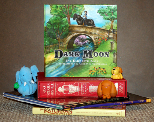
I just got copies of a recent children’s book collaboration with an author, and I’m pleased as punch!  The design turned out so nice, my images look vibrant, and my client is super excited.  What a happy ending.  Except, maybe not an ending since she’d like to work together on a sequel.

The book is currently available here on the publisher’s website, and I’ll post the Amazon link as soon as it’s up!

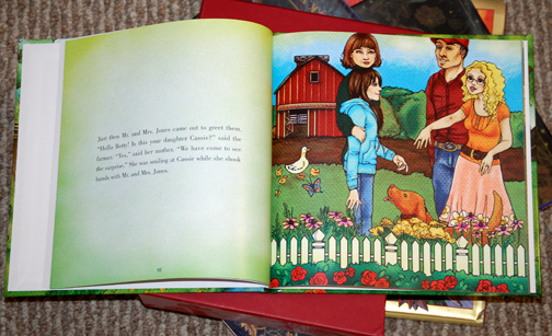
Here are some preview images:

Dark Moon1

Dark Moon2

Dark Moon3

Dark Moon 1

Dark Moon 12

It’s awesome that the author, Elizabeth Kass chose one of my favorite images from the series as the cover!  Let’s hope the book is a success!

*All book images copyrighted.

children’s books: to stylize or not stylize.

Sometimes I have a problem with being a little too literal. I did a sample for a publisher recently that took me more time than I would have liked and in the end had an illustration that was bright and engaging, but perhaps not exactly for children. The character in it was a girl who in fact wasn’t a character at all. Instead, she was a real girl that perhaps kids could identify with but not necessarily get into reading about and aspire to be. Design fail.

Likewise, clients often want something they constantly refer to as “cartooney” which I take to mean they want something stylized and less realistic. My personal work can’t really be referred to as cartooney, but I love other illustrator’s more stylized approaches and have recently vowed to take notice as I think my work for clients would greatly benefit from it! A few months ago I did this rough for a client. The colors are basically thrown in since it is just a rough and all wrong and the perspective is totally messed up, but I really like the base drawing and approach. I have a brand new client and the word “cartooney” is being thrown around and I feel inspired!
Le Magique Shoppe

fashion sketches and flats

My actual training is in fashion design work.  Designing is all well and good…every fashion designer dreams of having the freedom to creatively put together a line of clothing.  Unfortunately, EVERY fashion designer dreams of this.  So, naturally, opportunities of this degree are rather scarce.

It’s hard to find gigs even doing the drawing presentation, but that definitely is a fun part of the job, and not everyone who goes to school for FD has this type of skill.  Here are some examples.

Pickett’s Trail! new book out!

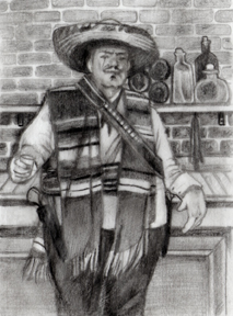
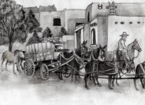
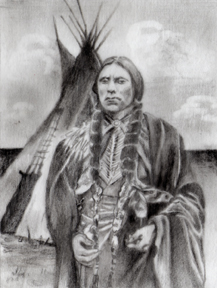
Last year I was working on a set of 13 illustrations for a Western novel called Pickett’s Trail.  The author is named Jon Lantz, but sadly the book was published posthumously by his uncle, Ron Lantz, who is a delight to work with.  Ron and I are collaborating on some other projects as well.

The book is now available on his publisher’s website as well as Amazon.com.

Here’s a peek at some of the illustrations:

el-lobo

gold-wagon1

leaving-missouri

twin-towers

quannah1

All images © Jon R. Lantz.

brightly colored work

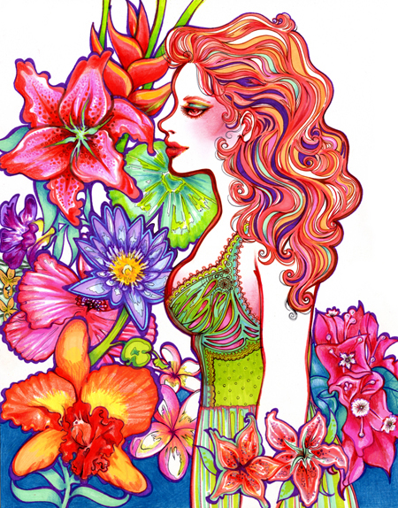
In more recent years, I just love working in color.  Usually this manifests itself in all kinds of neon hues and mixed media!

This was done as a gift for my friend Melissa.  It's a mixture of ink pen, color pencil, concentrated watercolors, and gold ink.

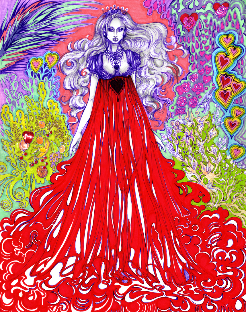
This is an image of the Queen of Hearts from Alice in Wonderland.  Ballpoint pen and marker.

Please do not take my images and use them without permission.  It is okay to repost with a link back to my site, though.  Please just ask me if you have questions at <courtney><trowbridge><at><gmail><dot><com>.